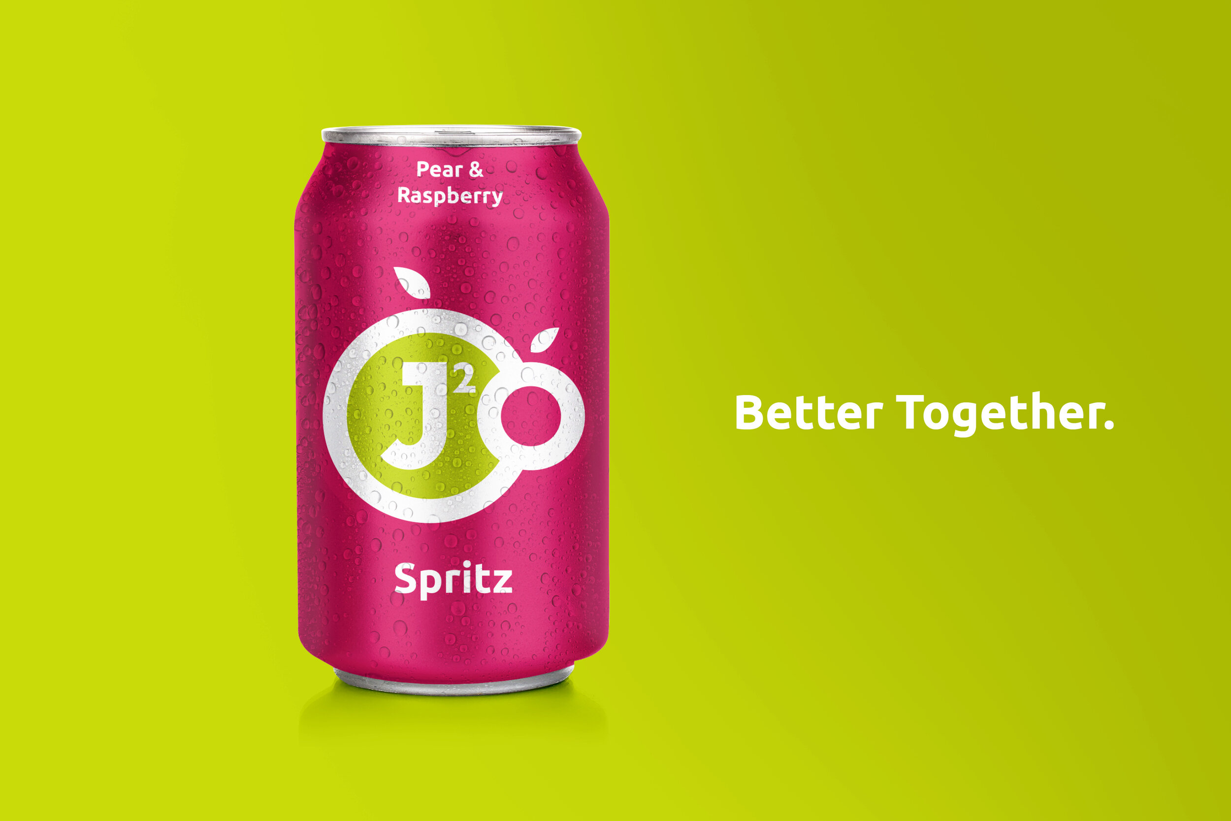
J2O, Better Together.
Throughout lockdown, I wanted to challenge myself by taking on an existing brand of my choice.
Being a frequent J2O drinker, I felt that there was a missed opportunity with their look and feel.
During the uncertainty of a pandemic, I ended up branding them in a personable way to reflect
this sense of togetherness that I felt we all so badly needed.
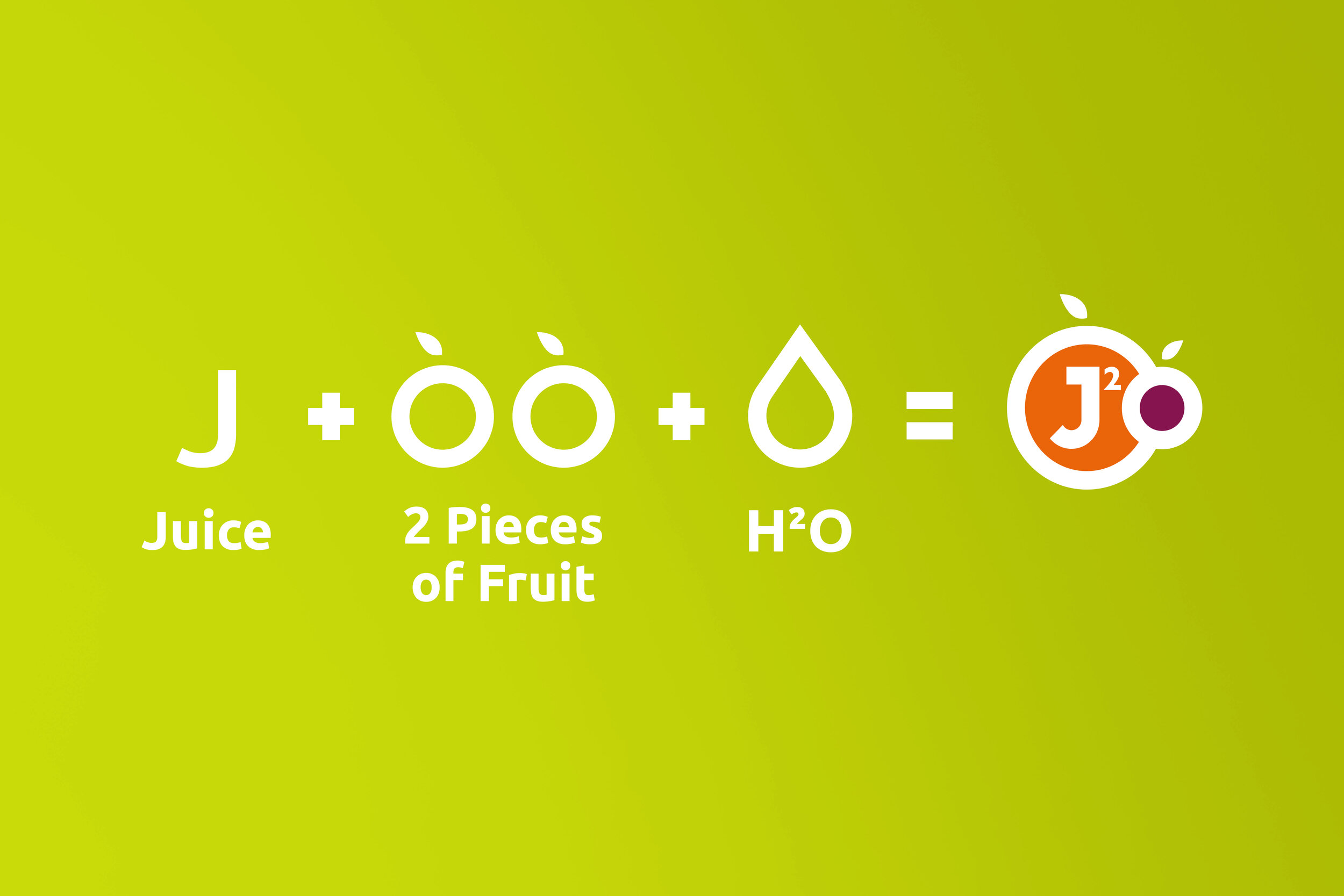
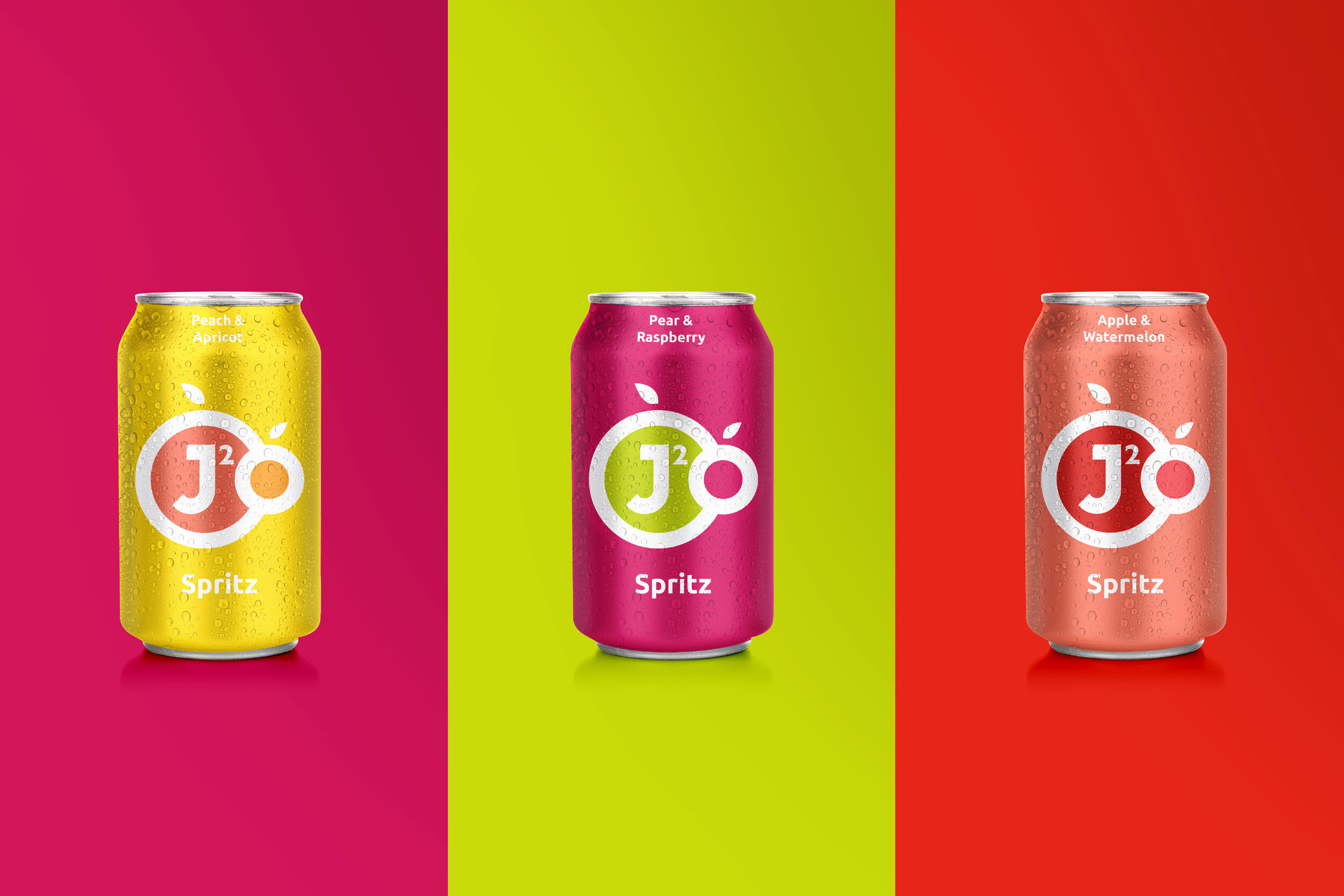
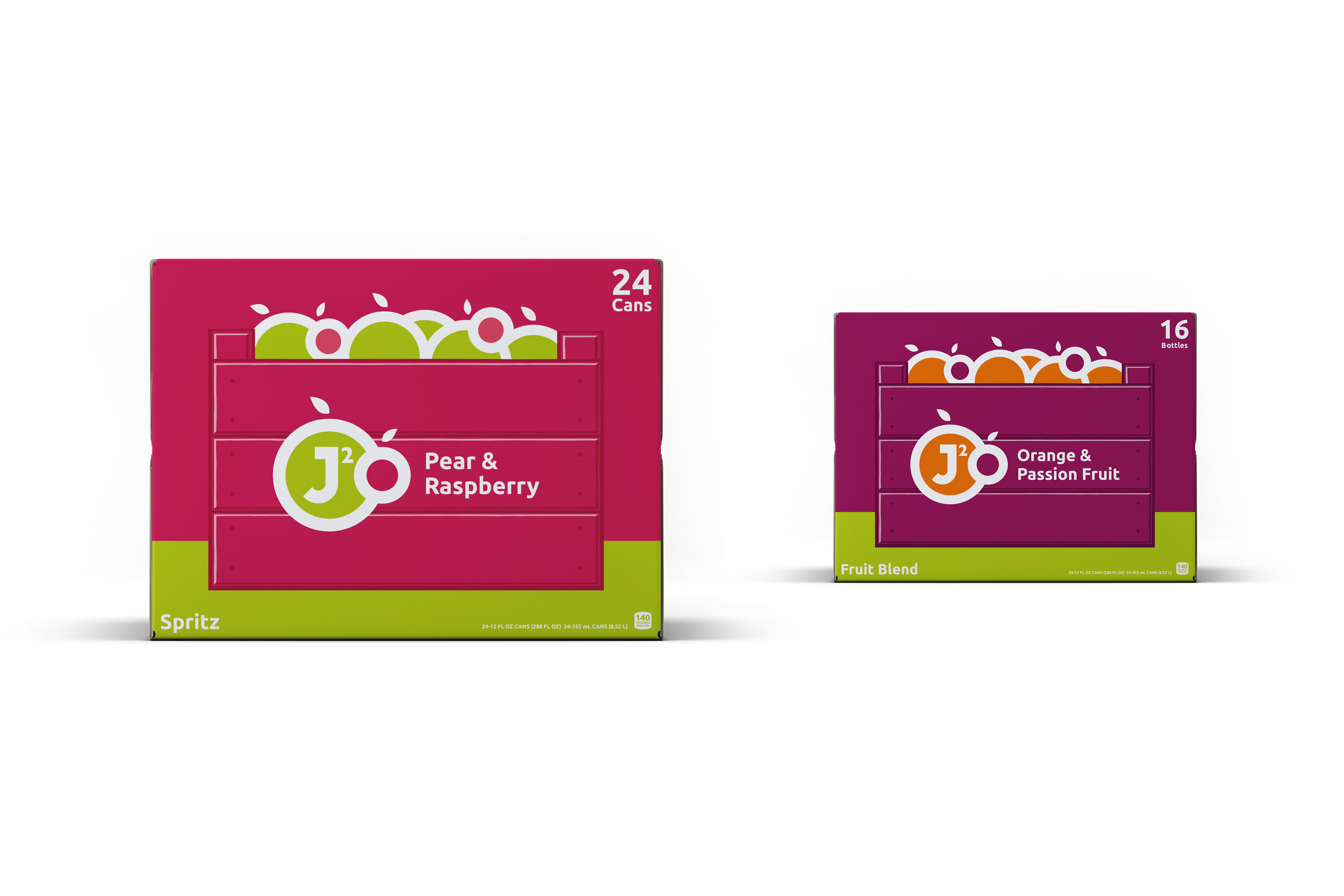
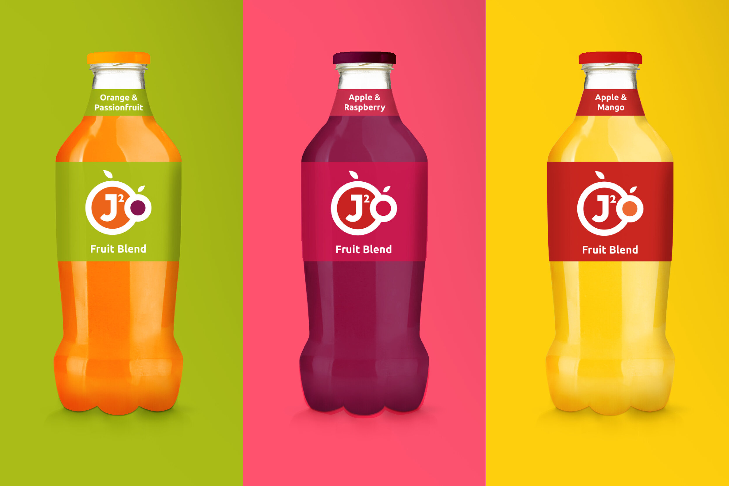
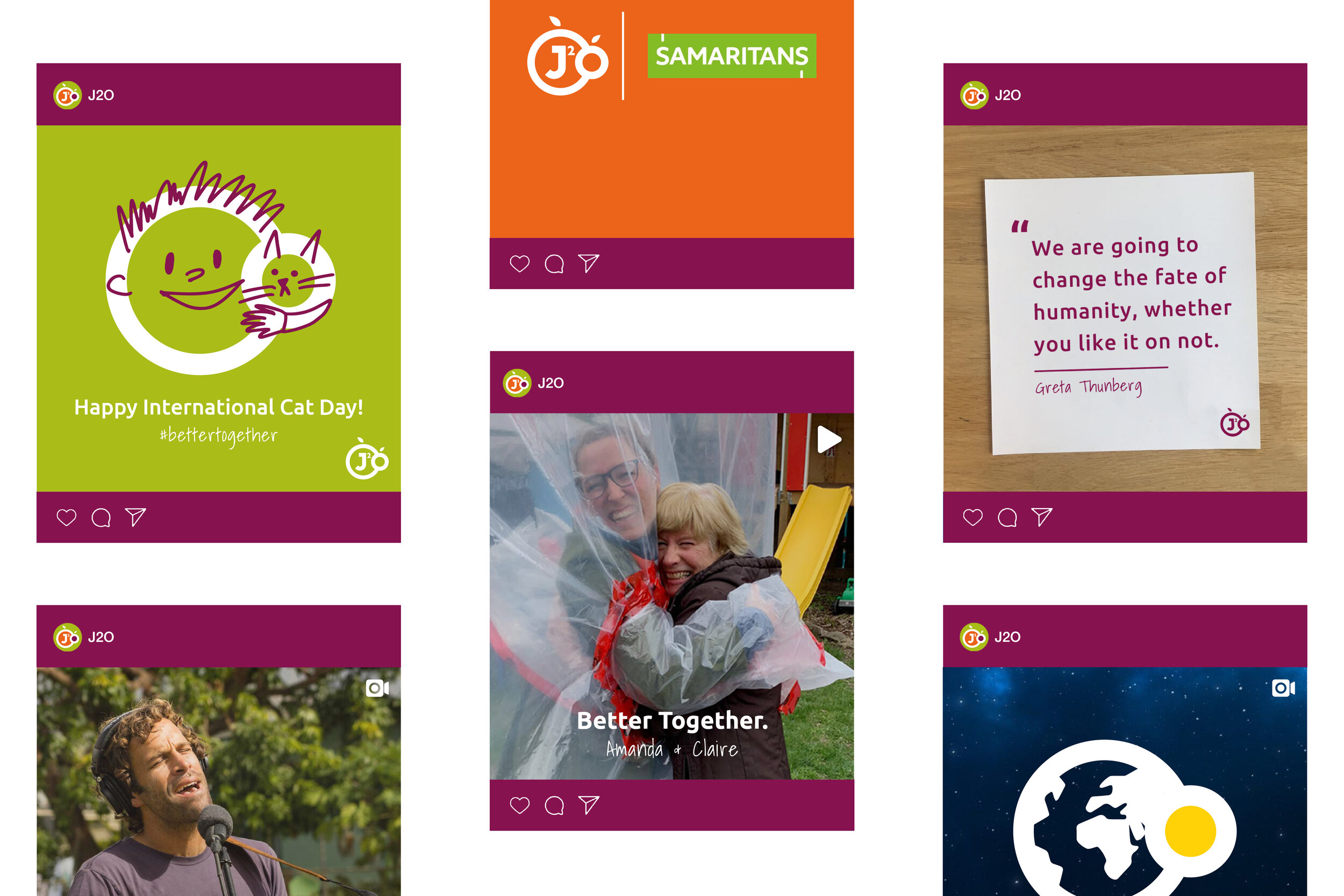
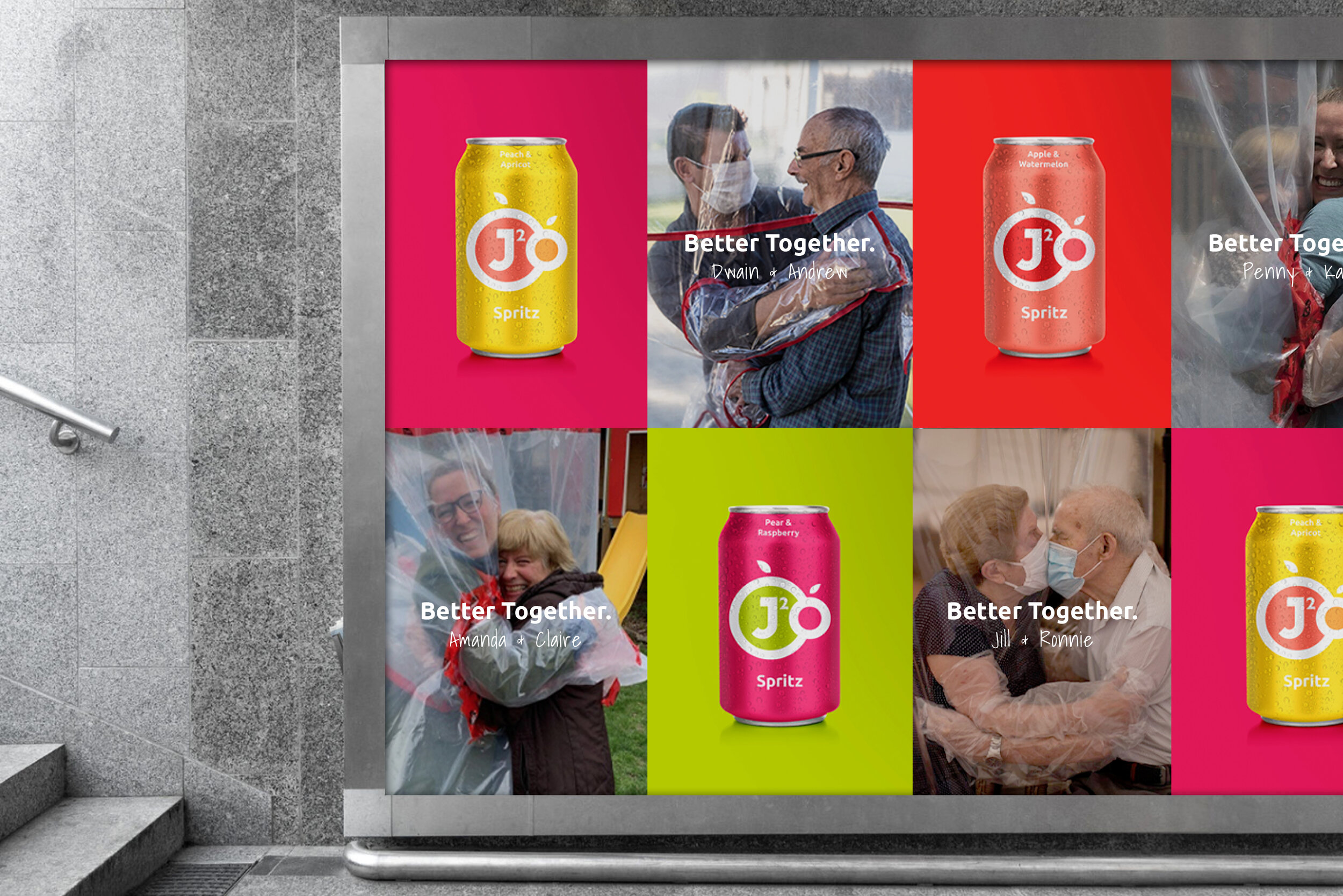
Noticing that all of their drinks consist of two flavours, I came up with the strap-line ‘Better together.’ The ethos ‘Better together’ runs deep into all elements of the brand, from buying fruit nearby and supporting local farmers, to collaborating with Samaritans to make sure that everyone has someone to turn to. A sustainable and ethically forward-thinking brand, I wanted this to be reflected throughout, right down to their packaging.
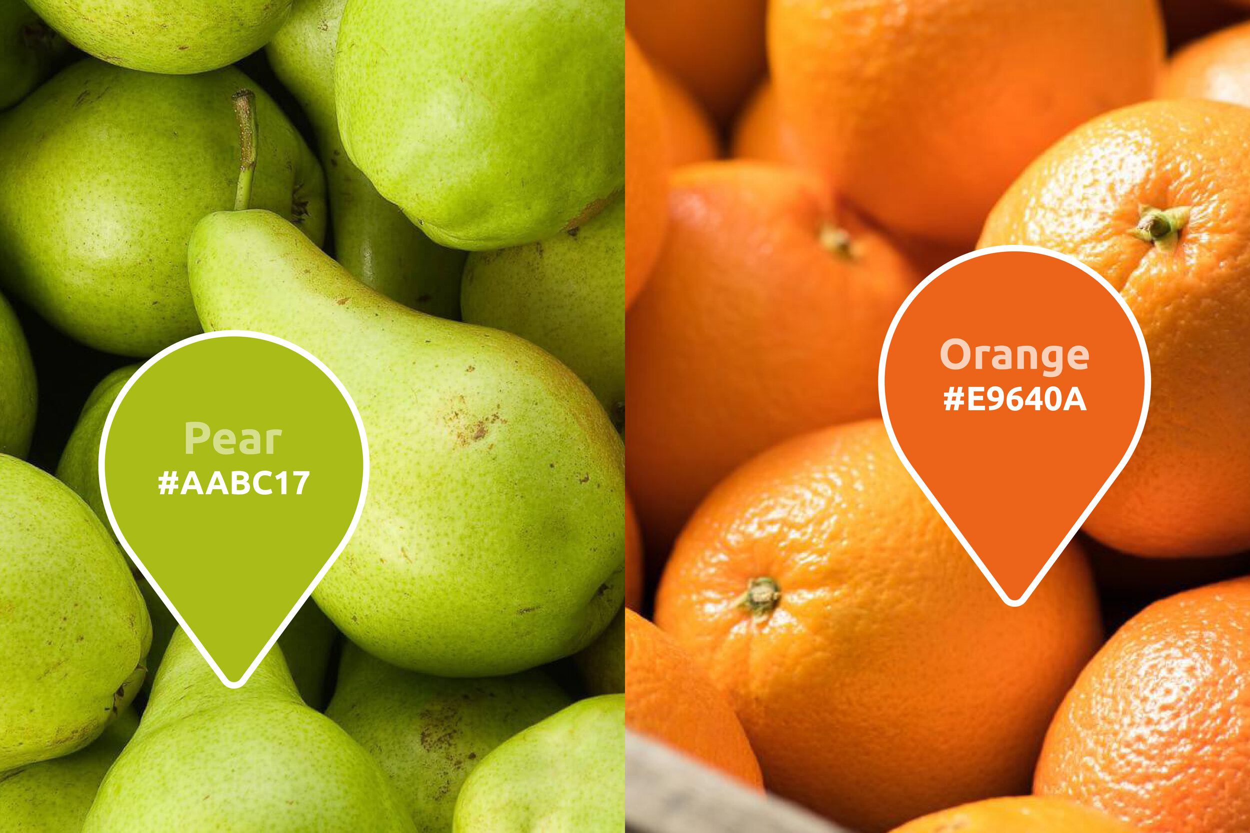
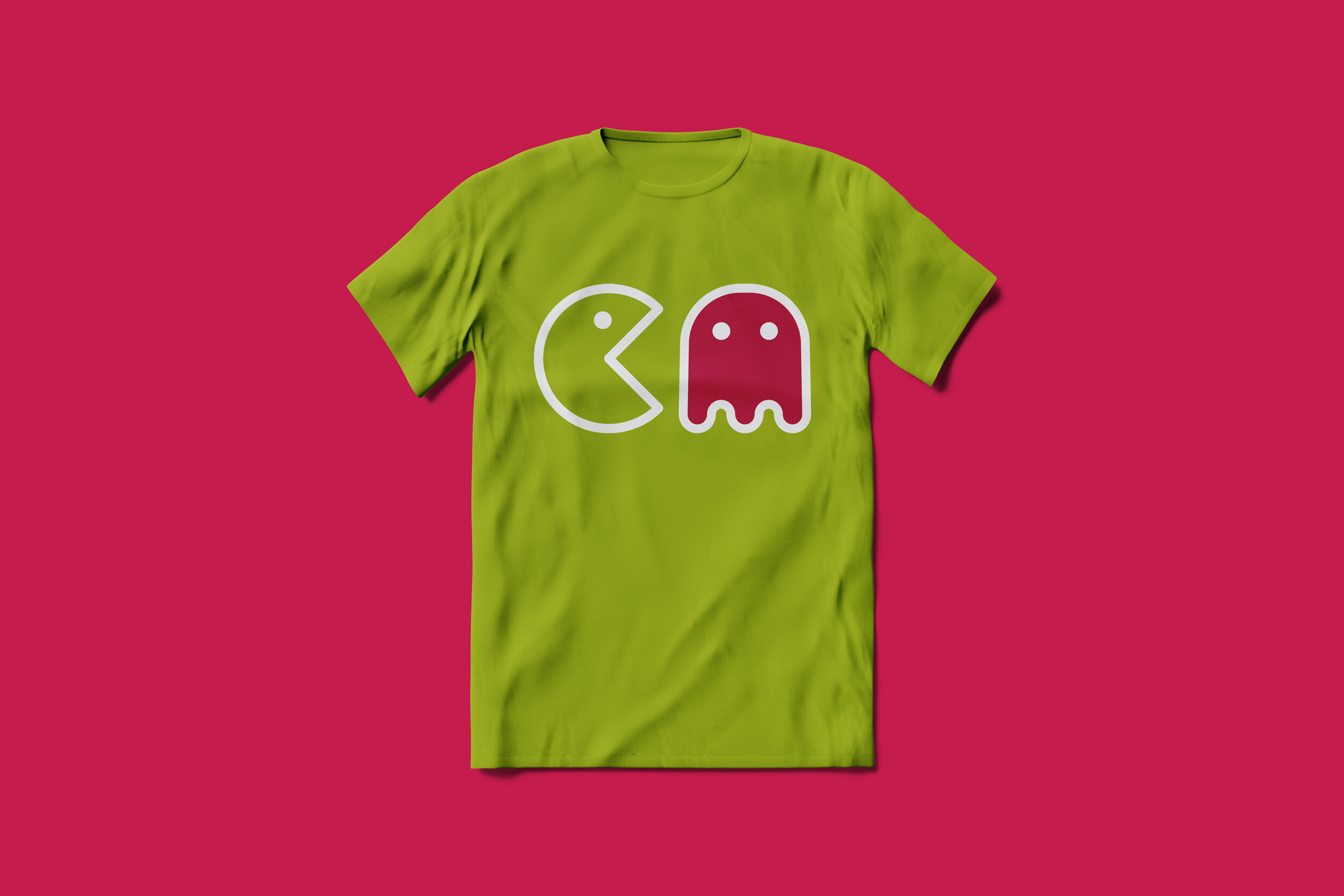
With a vibrant colour palette and playful and expressive use of icons, I hope I have brought a new dimension to the brand, presenting them as cool, young and new. With these being the brands core values it was important for them to renew their visual communication and design to stay on trend with their competitors.
