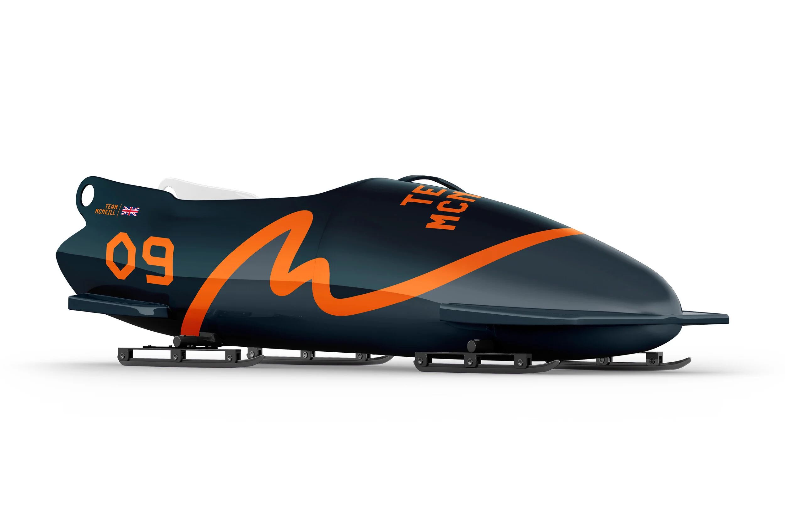
Team McNeill
When we were first approached to create an identity for Team McNeill, the brief was very difficult to navigate and with numerous hurdles along the way, the project sadly soon fell short and never actually came to fruition.
This was a project I really enjoyed at work and I felt it had a lot of potential. I wanted
to develop this project in a direction that I felt was best suited for it. I create a sense
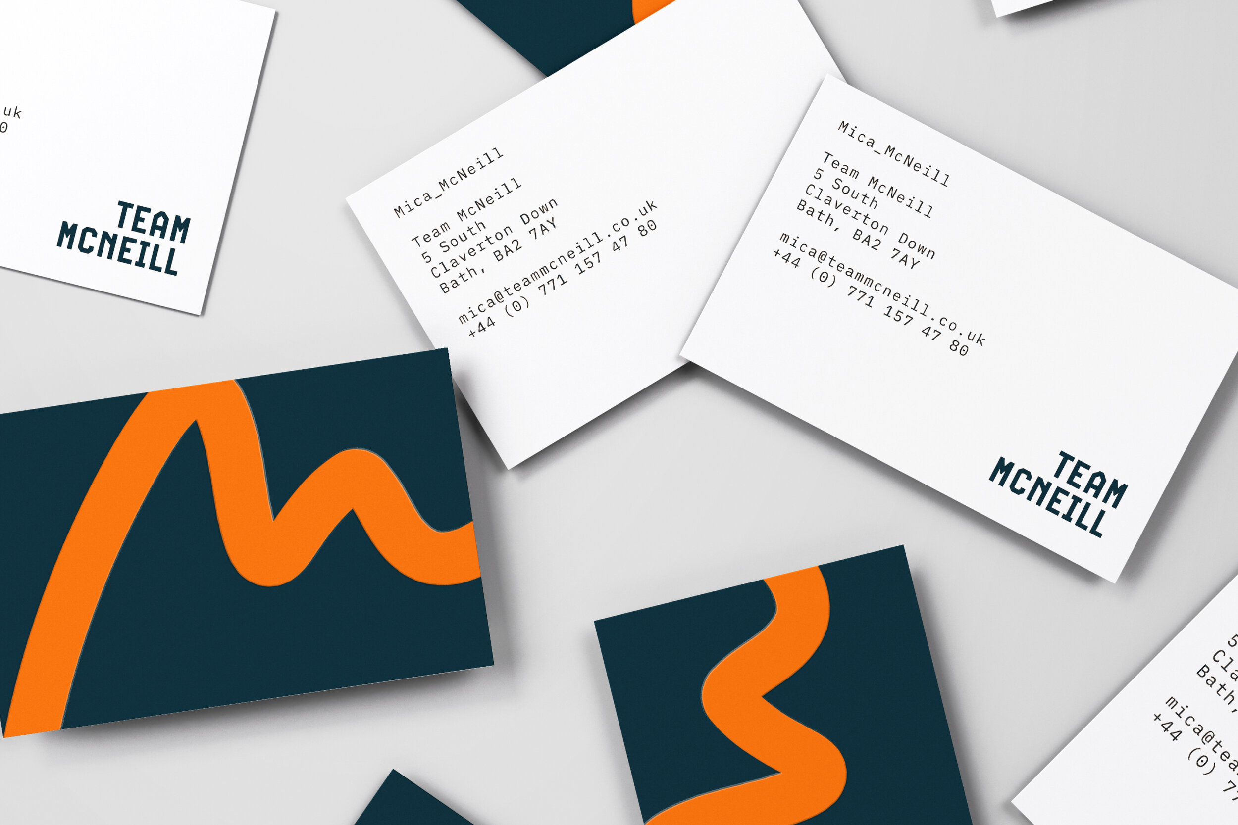
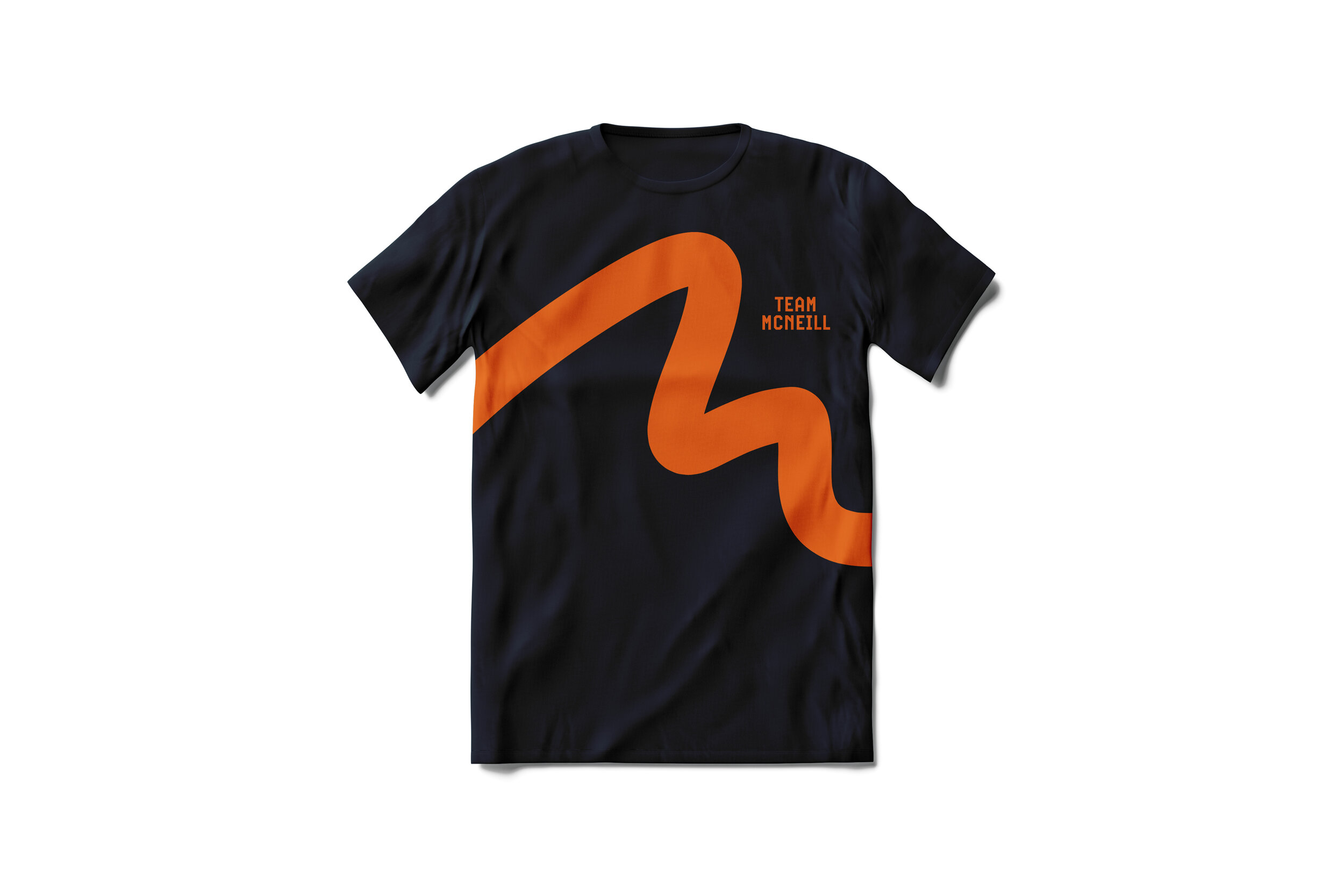
of movement which is shown in the free-flowing hand-drawn mark, reflecting a more personable feel to the brand. There are small, indirect links with the letter “M” looking
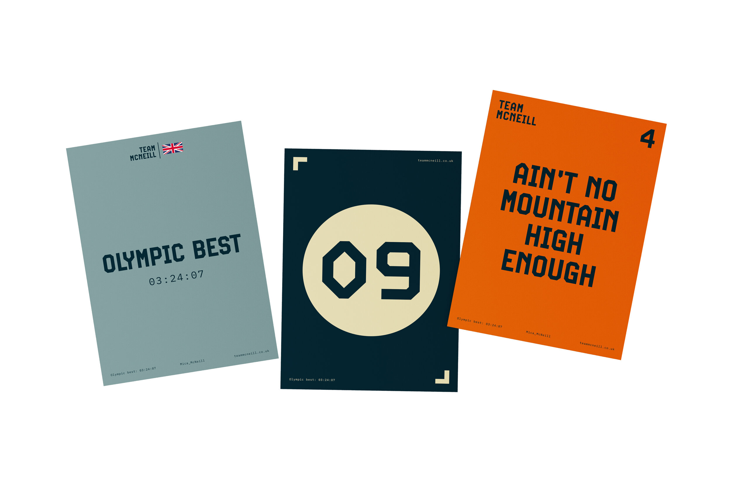
almost like mountains referring to their saying; “Ain’t No Mountain High Enough”.
Being able to work on this project alone, I was really able to explore a wider colour palette
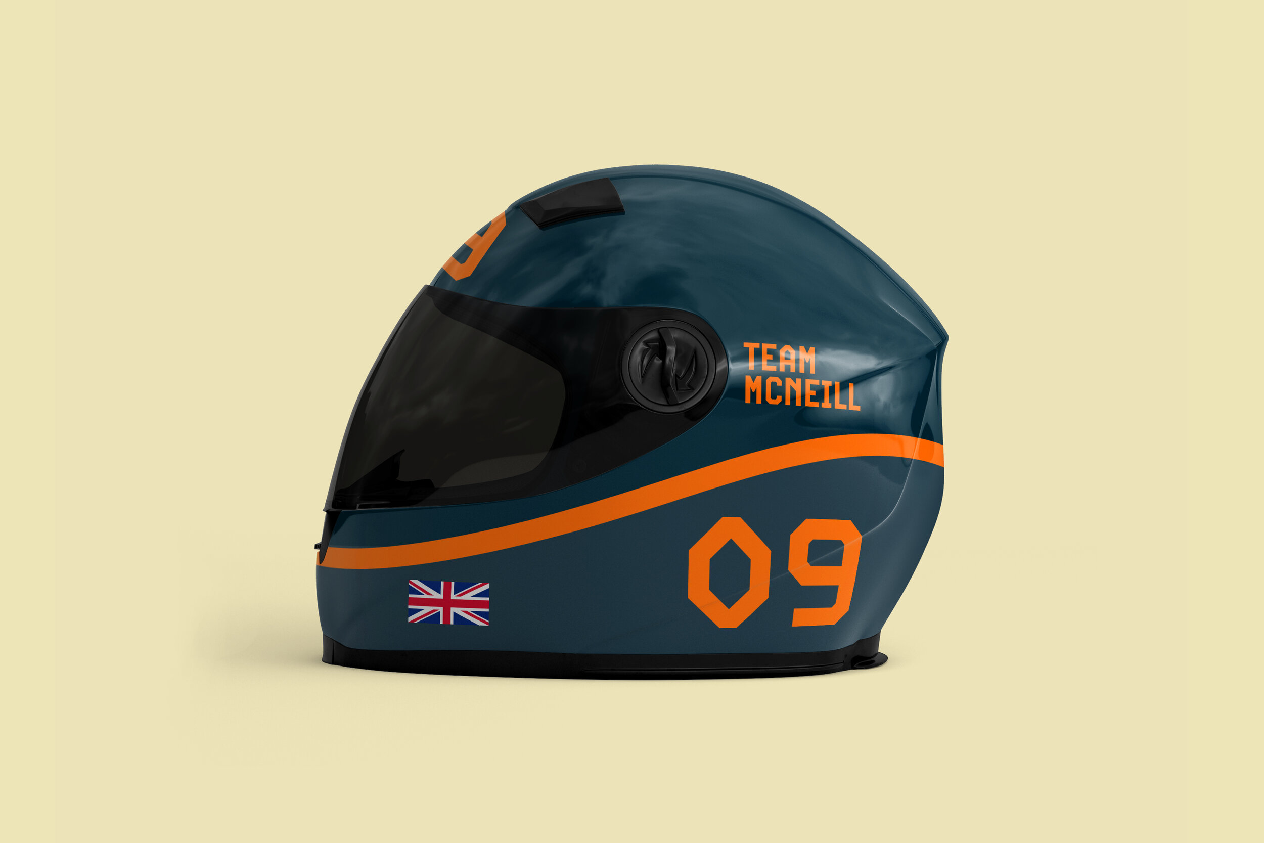
as well as use a more expressive typeface. The vibrant orange I feel creates a sense of energy against a really dark blue which helps bring in a level of sophistication.
